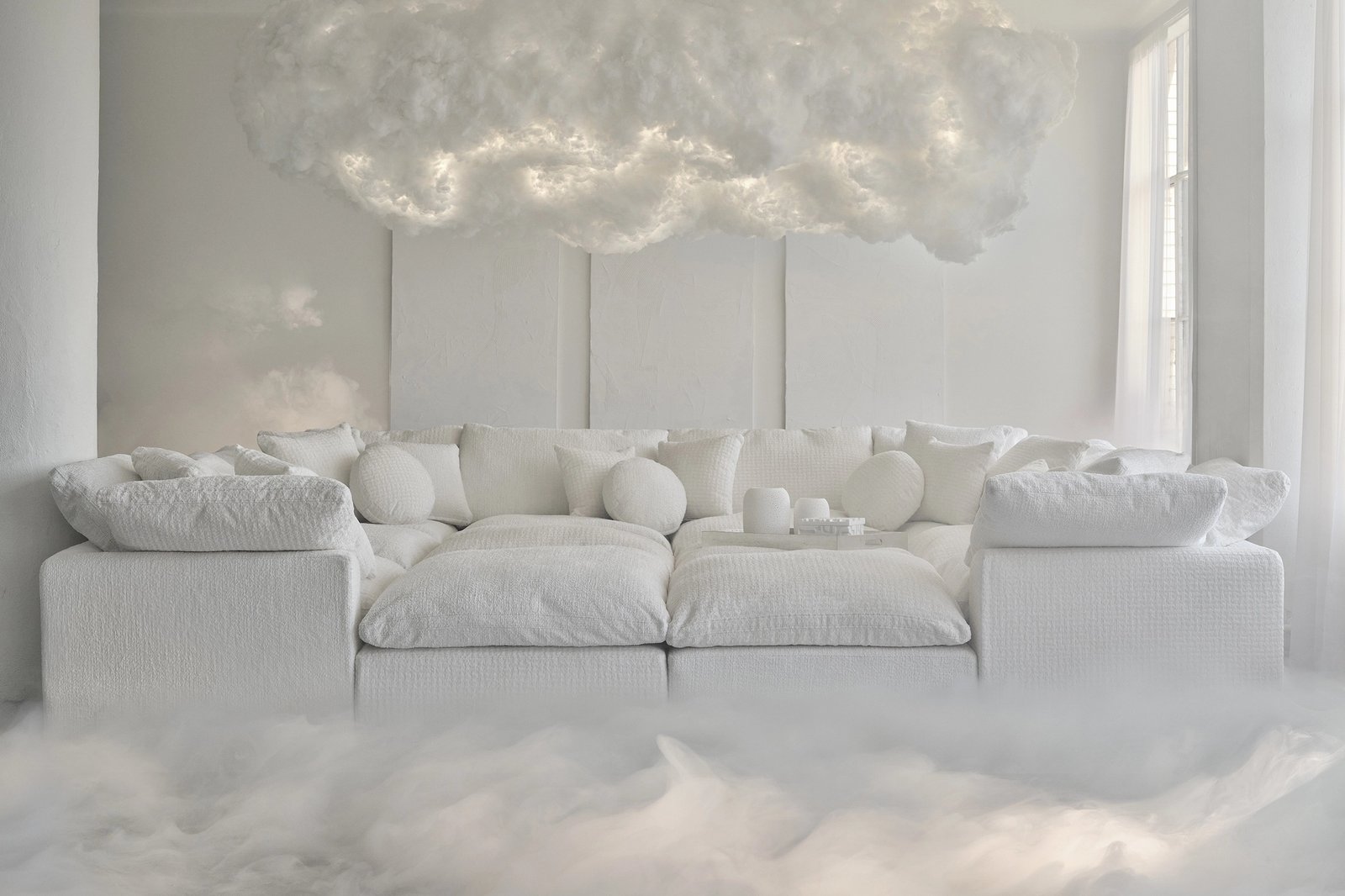

If 2026 had a mood, it was the deep breath. Pantone opened the year by naming a white its Color of the Year. Milan spent Design Week celebrating the hand over the algorithm. Fashion’s new creative directors went back into the archives to find a way forward, and the Venice Biennale asked visitors to slow down and listen. Here is Trendland’s 2026 Design & Culture Trend Report: nine trends across color, interiors, design, fashion, graphic design, typography and art, each with the names that defined it.
Our last forecast, Trend Forecast: 2017 Design & Color, was about saturation. This year runs the other way. The common thread is calm, texture and proof of a human touch.
1. Cloud Dancer and the white reset
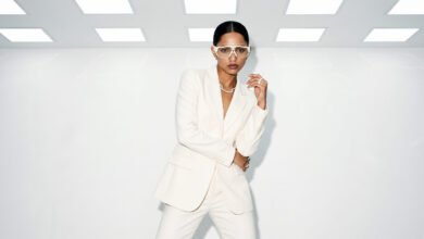
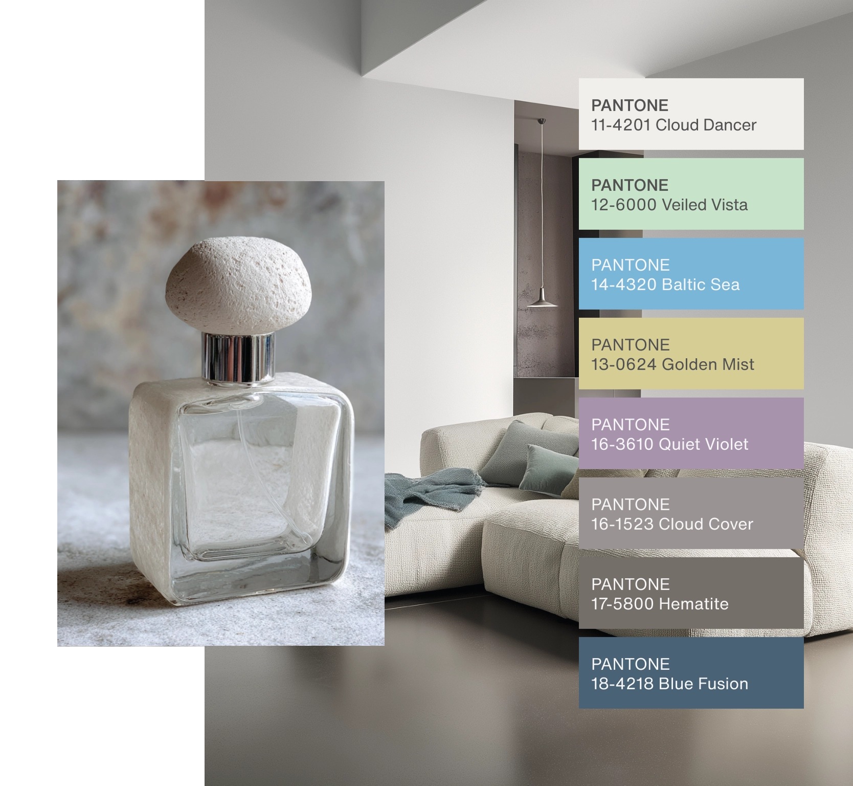
On December 4, 2025, Pantone named PANTONE 11-4201 Cloud Dancer its Color of the Year 2026. It’s a “billowy white” that Pantone calls “a whisper of calm and peace in a noisy world.” Pantone frames it as a blank canvas and a fresh start, and as a quiet push back against excess. It’s a far quieter pick than Classic Blue in 2020. It reached the shelves fast. Official partners include a Cloud Dancer edition of the Motorola edge 70, a furniture collaboration with Joybird, Post-it Notes and Play-Doh. Pantone also launched an artist series, starting with a limited-edition tote by the illustrator Emiliano Ponzi.
2. Espresso and khaki: interiors get tailored
The paint brands answered Pantone’s white with depth. Benjamin Moore picked Silhouette AF-655, which it describes as rich espresso with subtle notes of charcoal, inspired by “the modern take on classical suiting.” Andrea Magno, the brand’s director of color marketing and design, pointed to “the growing interest in the brown color family.” Sherwin-Williams went for Universal Khaki SW 6150, a mid-tone neutral with a slight yellow undertone, under the line “Tailored & Timeless.” Pinterest saw the same shift in fashion and called it Khaki Coded: pleated trousers, utility shirts and field jackets. In interiors and wardrobes alike, the 2026 neutral is warm, worn in and cut like a good jacket.
3. Neo Deco and the return of fun
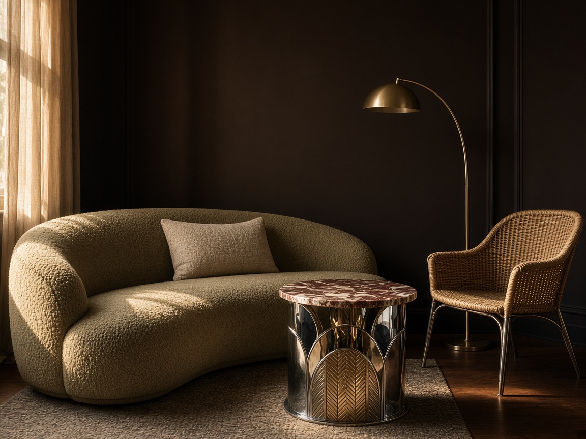
Pinterest Predicts 2026 named 21 trends, and two of them redraw the home. Neo Deco brings back Art Deco “shiny, sleek and tuned to 2026”: crisp chevrons, fan arches and geometric accents edged in chrome or brass, driven by Gen X and Millennials after years of heavy minimalism. FunHaus is its playful cousin, with circus-inspired stripes, sculptural silhouettes “and just a wink of clownish charm.” Pinterest says comfort is the emotional anchor behind it all: 55% of the people it surveyed globally named comfort as a daily need. For deco done right, see Trendland’s Art Deco Biarritz home and Paradiso Ibiza Art Hotel.
4. Soft metal
Chrome isn’t going anywhere; it’s just getting softer. AD Germany’s report from Salone del Mobile 2026 described a turn away from “rough edges and industrial rigidity” toward sculptural, often playful metal. Enne paired cool metal with bouclé on its Lien sofa. Arflex’s Botolo chairs combined chrome with curly sheepskin. Ukrainian maker Furn Object’s Glimpse floor lamp made steel look almost melted. Expect metal next to wool, fleece and marble, not on its own.
5. The intelligence of the hand
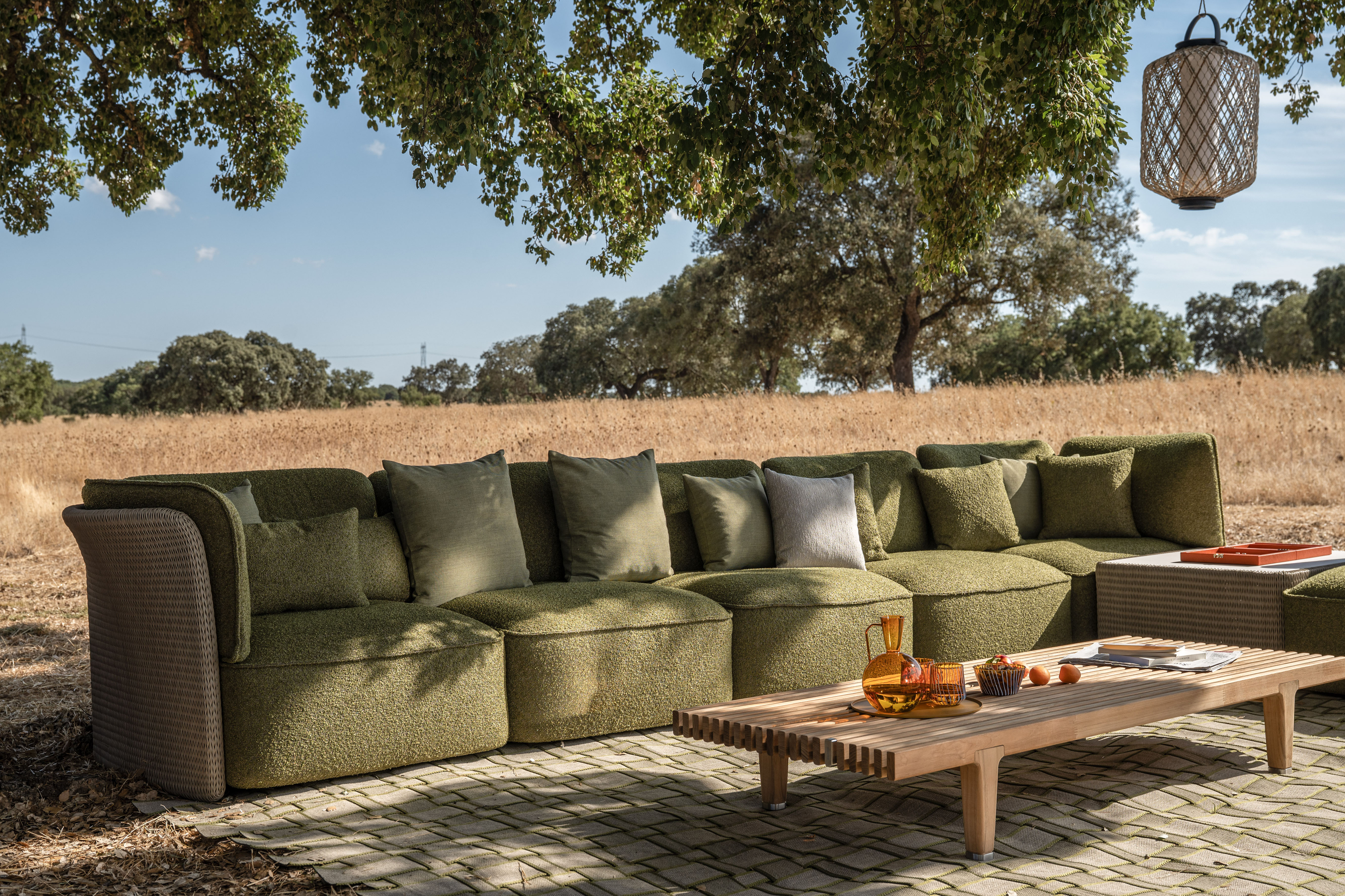
The biggest idea at Milan Design Week 2026 was making things, out in the open. AD’s editors described “a return to fundamentals” in contrast to “the relentless acceleration of AI-assisted creation.” Missoni built its show around a giant industrial knitting machine producing fabric in real time. Loro Piana presented around two dozen plaid studies as material research. Prada Home showed handmade Japanese ceramics in an exhibition curated by Theaster Gates. Weaving became structural: Edward Barber and Jay Osgerby, subject of a 30-year retrospective at Triennale Milano, designed Tricot for DEDON, a modular outdoor system hand-woven with a round fiber that holds bold, continuous curves. (Revisit our early look at Barber Osgerby Studio and our Milan Design Week 2019–20 trend report.)
6. Canary yellow
If Cloud Dancer is the base, canary yellow is the accent. AD’s editors spotted it all over Milan: in a sunny bar and the new Naki Sumo side table at Fendi Casa, on the cushions of Cassina’s reissued 1960 Panton Peacock chair, and on B&B Italia’s reissue of Richard Sapper’s 1984 Nena folding chair. It’s an optimistic, slightly retro yellow, the city’s own color, and an easy way to warm up a white room.
7. Fashion’s great reset
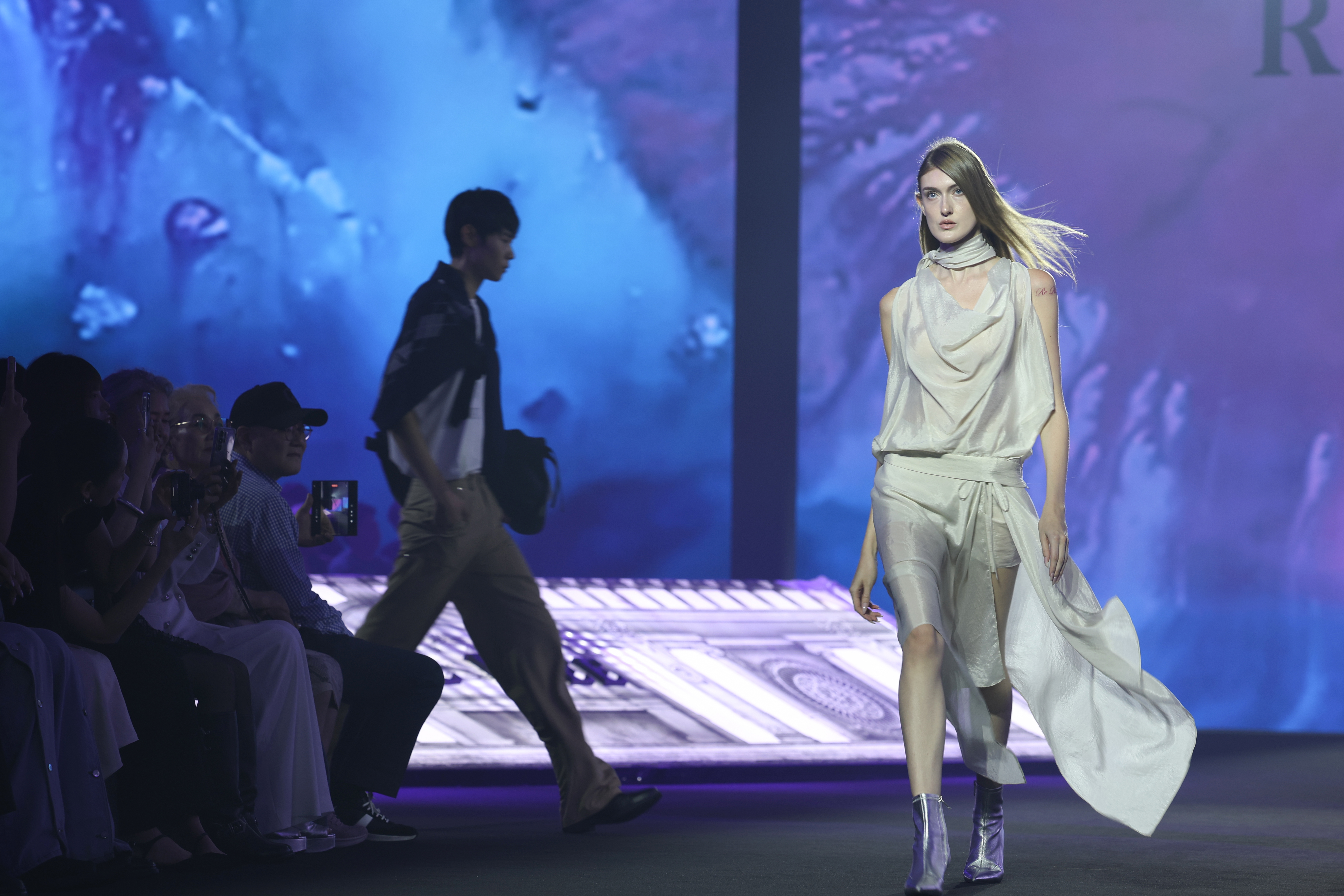
For Spring/Summer 2026, Wallpaper* counted 15 creative-director debuts, a season the industry called “fashion’s great reset.” The lesson was that the archive is a tool, not a cage. Jonathan Anderson’s first Dior womenswear show turned the flared waist of the Bar jacket into a blossoming bow and shrank the New Look’s proportions. Matthieu Blazy’s first Chanel show ran to 77 looks, with a softer, crumpled 2.55 and “tweed” made of thousands of tiny glass beads. Louise Trotter built Bottega Veneta around intrecciato weaving, Pierpaolo Piccioli started Balenciaga from Cristóbal Balenciaga’s 1957 Sack dress, and Demna introduced Gucci with La Famiglia, a lookbook shot by Catherine Opie. On the street, Pinterest predicted the same appetite for drama: Glamoratti (bigger shoulders, bolder gold) and Poetcore (oversized turtlenecks, vintage blazers, messenger satchels).
8. Type with fingerprints
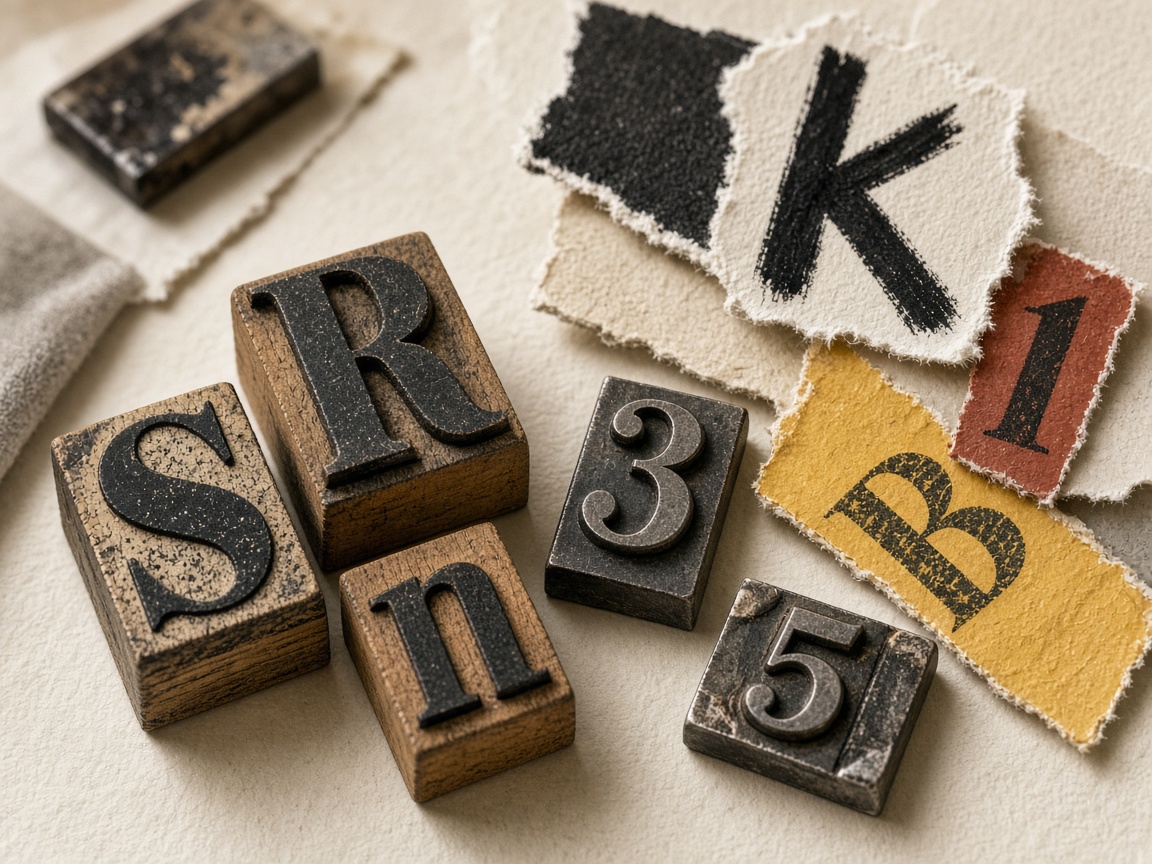
Graphic design pushed back against smooth, generic AI output. In Creative Bloq’s 2026 typography forecast, Lucas Luz of &Walsh argued that “serif typefaces are making a comeback, not out of nostalgia, but out of necessity.” BUCK’s Max Vogel pointed to a revival of ’60s and ’70s ITC and photo-lettering. Frere-Jones Type’s Fred Shallcrass recommended deliberate friction and noise. It’s Nice That called its version “Pick and Mix”: lettersets that break their own rules, like Design Office Fun’s identity for Trobar (built from letters scavenged in secondhand bookshops) and Varada Rege’s Tapeface. PRINT’s 2026 Type Report summed it up as “ingenuity over artificiality.” Trendland readers have been here before: our Blossom Type floral alphabet and Art Deco typography for The Deco still draw visitors.
9. Art in a minor key
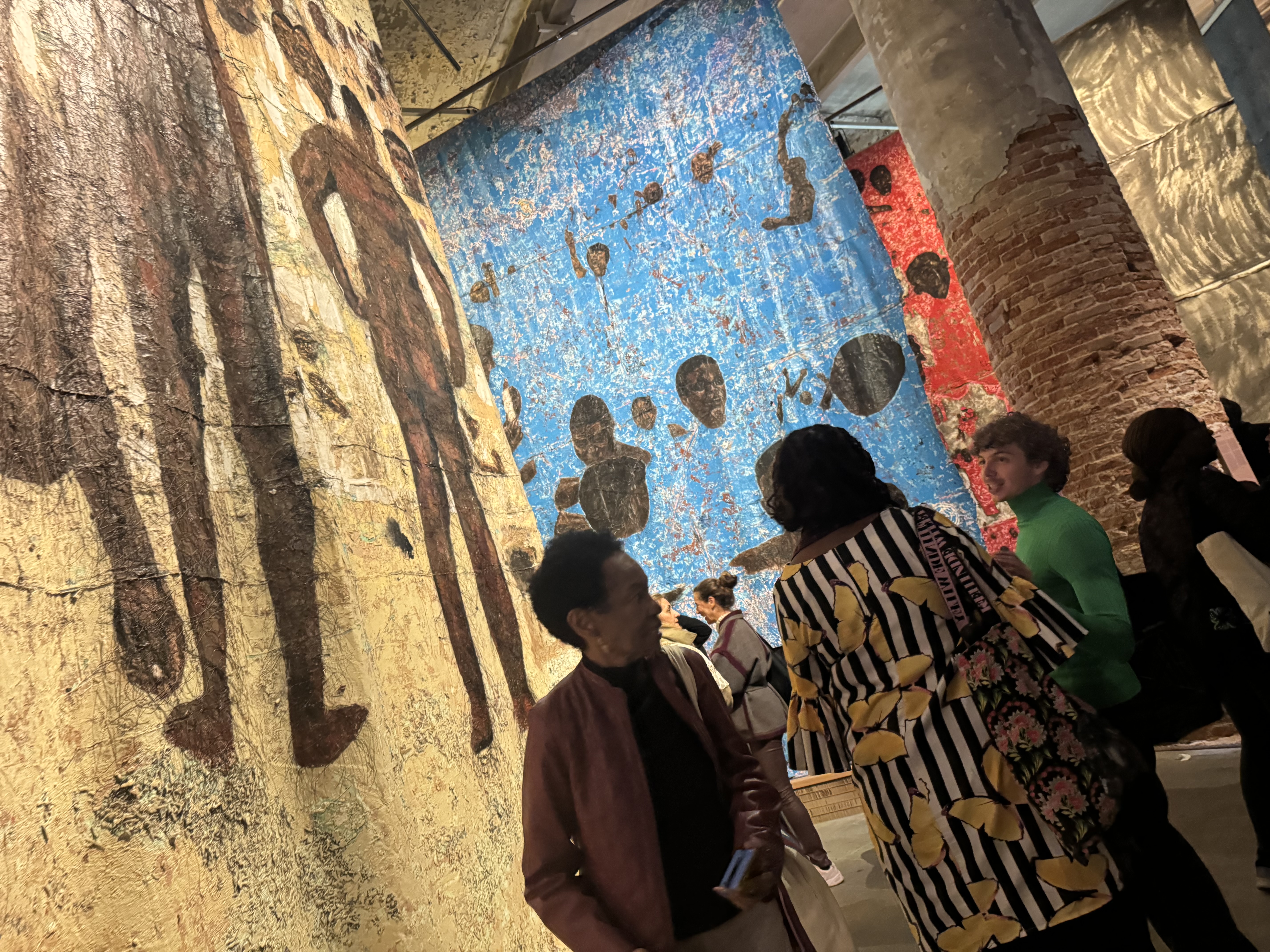
The 61st Venice Biennale, In Minor Keys, opened on May 9 and closes on November 22, 2026. Its curator, Koyo Kouoh, died in May 2025, and her team (Gabe Beckhurst Feijoo, Marie Hélène Pereira, Rasha Salti, Siddhartha Mitter and Rory Tsapayi) completed her plan with 110 artists, among them Wangechi Mutu and the London- and Lagos-based sculptor Ranti Bam. The show opens with Khaled Sabsabi’s Khalil and is built around rest, healing and deep listening. Critics split. The Art Newspaper called it rich but uneven, and the Guardian questioned asking visitors to relax while the world burns. Still, the message matched the year. Don’t miss our visit to the Japan Pavilion’s 208 cool babies, or look back at the 55th Biennale.
What it adds up to
The 2026 trends share one instinct: make room. That means a white that clears the slate, browns and khakis that feel tailored, metal that softens, fashion that rereads its own history, type that shows the hand, and art that asks for patience. Expect 2027 to build on it, with more craft and more character, plus a little Neo Deco glamour.
Image credits: Hero, Joybird x Pantone Color of the Year 2026 (Cloud Dancer), image courtesy of Pantone, via pantone.com. In-body credits appear in each caption. Sources: Pantone, Benjamin Moore, Sherwin-Williams, Pinterest Predicts 2026, Architectural Digest, Wallpaper*, Creative Bloq, It’s Nice That, PRINT, Salone del Mobile.Milano, The Art Newspaper and the Guardian.
Source link